Wednesday, 18 May 2011
Thursday, 5 May 2011
History of Music Videos - Pioneers
History of Music Videos - Developments of Music Videos on TV
History of Music Videos - Influential Videos
History of Music Videos - Analysis of Two Music Videos


Tenacious D - Tribute
The camera angles used during this video are long shots, medium shots and close ups to show what the band members are wearing.Its very important what the performers wear because its a good way to promote the band and to target a specific audience. The narrative follows the band members of Tenacious D and they are walking through a shopping centre where they come across a recording studio. The band members use the recording studio to record their single. Jack Black uses a guitar and this mise-en-scene indicates that the music is rock. Another story occurs at the same time when Jack Black imagines himself and Kyle Gass walking along the road and they encounter the devil in which they have to kill off with their music. Special effects are used where purple light comes from Jack Black. Furthermore, the devil is bigger in size which is seen as a special effect.
Michael Jackson - Thriller
At the start of this music video opening credits are there which show that this is more like a theatre production or a film. The actual song spreads out during the middle of the video with directors credits at the end. The narrative follows Michael Jackson taking his girlfriend to the cinema where they watch a scary film. On the way home they walk past a graveyard and the dead bodies begin to come alive. The well choreographed routine involving Michael Jackson starts. The camera angles used are close ups, extreme close ups and medium shots which show Michael Jackson as both a performer and actor in the narrative.
Wednesday, 4 May 2011
Two Door Cinema Club - Album Advert

Unlike other album adverts, the one done by Two Door Cinema Club has more information shown. The main information like band name and album name are shown but also the dates of their tour. The dates of the tour have a large 'SOLD OUT' over the venues. This could suggest that if they are sold out then they are a very good band and their album is worth buying. In comparison to the Marina and the Diamonds advert, there are the names of popular singles to indicate to the people that like them that the album is being released. The main image is a cat staring out at the audience. This relates to the actual album cover because that is the main image of the album. When concerning our advert, we would like to follow the names of singles idea and the image which grips the audience.
Kings of Leon - Album Advert

The album advert for 'Come around Sundown' is very simplistic which relates to many Kings of Leon albums. The main background is the picture of the new album itself where the audience can make a link by seeing the advert in the magazine and then seeing the album in a shop and thinking that they had seen that advert. There isnt too much information for the audience to read so it makes it easier to be marketed. The main titles are the date of release and of course the name of the band and album. In the bottom left hand corner there is an HMV symbol which also advertises the place in which the audience can get it. In our advert we would like to create something which is simplistic with an image of the album.
Marina and the Diamonds - Album Advert
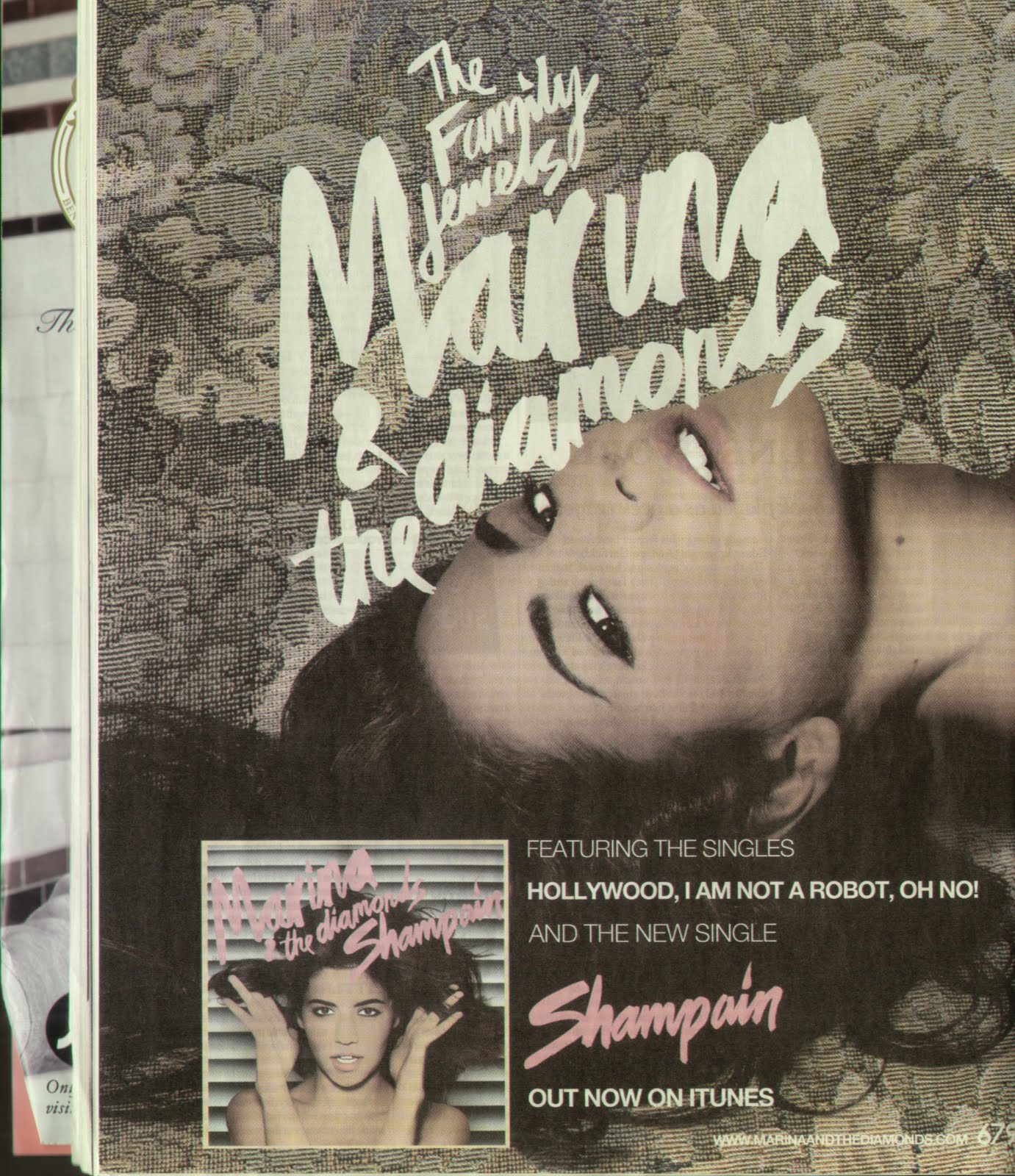
The advert for the album 'The family jewels' featured in an edition of NME. This shows that they take into account the genre of the magazine as Marina and the diamonds is seen as an NME artist. The advert features a huge image of the music artist to catch the readers attention as they read the magazine. The advert includes the names of popular singles to say to the audience that they might enjoy other songs on the album if they like the popular singles. Furthermore, the advert tells the reader where they can download the album from. If the reader has an Iphone or Ipod they can instantly access Itunes and download the album there and then. In the bottom right hand corner the marina and the diamonds website is included so that people can view the website to find out more information on the artist. Although the album is being marketed, the new single 'shampain' is marketed at the same time with a larger font in a bright pink colour. In relation to our album advert we would like to include an image of the artist and market individual songs at the same time.
Vampire Weekend - A-Punk Album Cover

The ablum cover for A-Punk is still very simple as they have just used a still image from their video. This dominates the front and anyone viewing the cover will know that this is A-Punk because of the video image. The black background makes the band name and song stand out. For our video we will be looking to have a simple cover because it fits in with the genre.
David Bowie - Album Advert

For this album advert. The producers have gone for the use of live band performance shots to appeal to the audience. In particular the people who went to this performance can see the shots and recognise that they were there. There is more description on this advert than the other adverts. This suggests that the target audience is someone who really likes David Bowies music because this is an exclusive CD. Similarly to the Kings of Leon advert there is an HMV symbol which shows the audeince where they can buy it from. In relation to our DVD cover and Advert we would like to include live performance shots to appeal to our target audience.
Tuesday, 3 May 2011
The Temper Trap - Conditions Album Cover

The Temper Traps album cover for Conditions is very simplistic but still gets its emotional message across. The use of black colour is associated with depression and sadness. In the eyes of the face on the cover the audience can see the hurt. This simple album cover is going to be similar to what we will produce. Our song is about a loss and the sadness that comes with it and therefore we decided that possibly a band still image during the performance will be suitable for the DVD cover. It will be suitable because the lead singer shows high emotions during the performance which can relate to sadness.
Manic Street Preachers - Journal for plague lovers album cover

In this popular album by the Manic Street Preachers a great sense of emotion can be drawn from the image. Obviously this can be disturbing as there is a picture of a beaten boy covered in blood. The emotion comes from the eyes which grabs the attention of the audience. The simplicity of the cover also reinstates the emphasis on the boys eyes. Simarly, we would like to add emotion within our album cover by having a person look right into the camera to grab the audiences attention.

The song 'Thriller' was part of a 25th Anniversary Album which celebrated the release of Thriller. Other best selling songs were also included in the album. To target the audience there is an image from the video on the front cover which is to promote the song by using an image associated with his popular song. Included on the front cover is a ratings certificate suggesting that the Thriller video could be scary when children under 15 are watching it. On our album cover we can link it to this one because we would like to include an image of the artist on the front to promote the artist.
Black Eyed Peas Album Analysis

Meet Me Halfway – album cover.
The first thing that I noticed about this CD cover is that it is very simplistic. Which is good. The black background is a good colour to use in this situation, as it helps to bring out the main features of the cover. The electric green colour is a great colour, and also the main the genre of music that black eyed peas produce is mainly electro. The font stands out very well due to the colour and the size. The white large font goes perfectly with the electric green and the style of the font helps it to stand out. What really stood out for me was the lightning bolts on the end of the Y and A, these were great features and very unique.
The design for this face I thought was very good, as it illustrated how much detail and time had gone into the shading and technical aspects of it. I liked the fact that it was made up of hundreds of little squares and that some were a different shading or colour to the next. The face is a very unique design for the black eyed peas, and even appears in some of their songs. One of the feature that I noticed was the black eyes that this face seems to have, highlighting that the band is called the Black Eyed Peas. The text at the top of the album cover is very clever as it states ‘The E.N.D,’ which stands for ‘the energy never dies’, I think this is very clever as it leads us to think that this CD will contain songs that have a high amount energy within them. I also think that the face is very well sculpted and very well made as it seems to have a lot of human features to it, such as the shape of the face and the shaping of the face makes it very humane like.
Black Eyed Peas Advert

Black Eyed Peas – Advert.
Many of the Black Eyed Peas album covers and adverts all have something in common, they all have a large amount of colour in them and they are very pleasing to the eye, this advert is no exception. First of all I realised, also like many other advert and album covers that it is a very simplistic and easy to read. I thought that the shading used in this advert was excellent and very clever. The shading of lots of different colours is very unique to the Black Eyed Peas and very original, as it has not been used before in any of their other covers. There is a very good use of colour within the advert as they seem very pleasing to the eye and capture the viewer’s attention, which is what an advert is designed to do.
This advert also gives the band members a sense of power, as the camera angle is low, which makes the viewer seem powerless, which is a good touch. Also, the style of clothing that they use is a very good style and suites the style of music that they play, which is very electro based. The colours of the cover although would not suggest that this is an electro, hip hop genre of CD, as it does seem to be wild with colours.
I think that the positioning of the actors is a great touch also, all together and united. The pose of the band member at the front is great as it shows that they have no fear, what with his arms spread out as if to say ‘come and get us’, possibly meaning come and by the CD. The advert seems be deceptive in the sense that the cover seems to be very calm and not much is happening in it, which is very misleading as the music genre is fast paced electro.
Finally, I think that this cover is very good as it is very secretive about the music genre, almost making people think the opposite. Also the shading was excellent and the style of the band members clothing and stance was an excellent choice.

Linkin Park album cover/advertising poster
As the song New divide was originally produced for the transformers movie, the CD cover was also used for the distribution of the song and the movie.
As we can see the cover for the single also shares uses a lot of colour to draw the viewer in and also to make it stand out. The large text of ‘Linkin Park’ and ‘New Divide’ seems to dwarf the text below, this is because the main aim is to distribute the single. The visual effects used suit the style of genre that the song New Divide was, which happened to be a very ‘up in your face’ song, as the CD cover uses mainly dark colours, this suggests that the song is about mystery and anger. The colours on the CD cover are very similar to the editing colours and special effects colours that are used in the actual music video.
The structure of the CD cover and adverts are the same as they are both used as on CD cover. The structure of the cover makes it very easy to read and understand as the font size and colour stands out against the dark background. The transparent ‘New Divide’ font is a great touch as it is very different to the rest. I particularly like the text style as it makes the CD cover stand out and is the original font style for Linkin Park. The cover uses a range of colours that possibly express emotions in the song, the colour red is used in the cover and there is a lot of anger and sadness in the video. Another colour that is used in the video is black, which could indicate mystery and death, as we main character is singing about the loss of a loved one. Also the colour blue is used a lot in the video and the cover, which seems to be that main colour, this could signify that sadness.
Monday, 2 May 2011
Men at Work - Down Under Music Video

Men at Works' Down Under was a succesful song during the 1980s and is often on 80s CD compilations. The video is rather narrative based which links to the lyrics. The start of the video which focuses on a Volkswagen Camper driving through the outback links very nicely to the title 'Down Under' which is the slang term for Australia. The only performance part comes when one of the band members plays a flute along to the riff in the song. The points which draw the audience in is the deliberate use of stereotypical humour associated with Australia like Vegemite. Personally the editing used in the video is simply panning and cuts to the next scenes. However the camera angles are better where there are many establishing shots to show the setting. Similarly to Down Under, our video will include establishing shots to create a certain mood in our emotional song. Personally I think this video works very well because it can create humour to entertain the audience and the narrative links to the video.
Coldplay - Speed of Sound Music Video
Above the link can be used to view the speed of sound video.
Throughout this video extensive links can be made to both the music and during the performance of our video. The song slowly builds up to a big climax which fits in with the video quite well through the use of lighting to indicate the big parts of the song. The band performance is particularly interesting. As an audience we gather the emotion on Chris Martin's face which is shown through close ups and extreme close up camera movement at the start. When the band shot is shown the use of a shaky cam gives us the evidence that the atmosphere is electric and the video is at its climax. The typical audience for this video would probably be supporters of the Coldplay music itself rather than the video because there is no narrative. Personally I think that this video works very well with the use of camera angles on the band and the music. The emotions we get from the lead singer leads us to believe that we should have a traumatic central event in our video.
The Killers - Mr. Brightside
Red Hot Chilli Peppers - Snow
Black Eyed Peas Music Video
Meet Me Halfway – Black Eyed Peas.
The third video that I am going to analysis is the video Meet Me Halfway by the Black Eyed Peas. This video has a massive amount of editing and visual techniques to please the audience and keep them interested in the video. to help me create a full analysis of the video are a number of questions that will enable me create a thorough investigation into the visual and narrative aspects of the video
First of all, effects.
This video has a massive range of special effects and editing techniques to wow their audience. Right from the word go there is a range of special effects, the first of which we see one of the band members Alp spinning in mid air whilst singing. After we witness Will.i.am is riding an elephant in space, which is a very unusual scene. The visual aspects of the video are very different to any other video this band has created, as Will.i.am quoted, ‘this video is very different in the fact that it is the most arty video we have created’. We do tend to see a lot of colours in the video, making the video bright and vibrant. The space setting makes the video very original and keeps the audience entertained. The one part of the video that stood out for me was the four shooting stars that crossed the sky, above the road that was shown at the beginning of the video.
The narrative I found was very hard to understand as it was not clear in the video and the lyrics did not match the video very well in the sense that the lyrics did not reflect what was happening in the video. The lyrics in themselves did not explain the narrative of the story which made it difficult to understand what it was about. The lyrics told a different story to the video which is what made it frustrating.
The live performance of the music video is very good, as we see the artists but a lot of effort into the characters they have to play, there is a lot of emotion in the video and the band members portray it well. The general story is portrayed through the artists live performance mainly, instead of the lyrics. Although the general idea of the music video is hard to understand certain objects enable you to pick them out which leads me onto my next point, mise-en-scene.
The mise-en-scene is a very good choice for this music video. As with the video’s genre, the items of clothing that they wear are very different to any other performance that they have created. The style of clothing switches back and forth, form old rags at the beginning to futuristic clothing at near the middle. The music uses a number of original settings which attracts the viewers attention and makes the video more enjoyable to watch. The video is also uses a number of editing techniques such as cross cutting, which helps us to understand the relationship between shots, jump cut, moving from one shot in the music video to another and long shot, this helps us to witness the type and style of clothing that the band members are wearing. Also, close up is a shot that is used a lot to show various emotions.
The success of the video is highlighted by the fact that it has a record breaking number of views in YouTube (33,107,379 million views!). I do think that the video has been a massive success, mainly because of the unique setting and items of mise-en-scene. This video also was a chart topping sensation, topping charts in Australia, Belgium, Germany, Romania, a variety of charts in the UK and USA. I think the target audience for this video is sci-fi viewers as there seems to be a lot of space age settings and the mise-en-scene seems to be very space orientated.
This video links in very nicely to ours, as there is a lot of emotion that is shown, much like ours and there is also a massive amounts of camera angles that were used in this video, and this is what we wanted to do in ours, to show a little variety.
Linkin park What I've Done advert.

Linkin Park- Advert.
The first thing that struck me about this advert was, like the album cover, it was very simplistic. Also that this advert seems to mirror a lot of the code and conventions that the Linkin Park album does. As the backgrounds black the uses of white font blend’s very well together, enabling the font to stand out. The red silhouette of the band members is a great choice, as it makes the members stand out, the red seems to be a dark red, perhaps showing that there is a dark side to this CD or for that matter, the band members. In the background, the images of the band’s logo is imprinted in a dark, mysterious grey, which gives us more reason to think that this album is going to be sinister. This is a great effect.
The mixed style of font on this advert is pleasing to the eye, as it makes the advert appear more interesting, as does the font colour. The band members on this particular advert appear to have the same stance as those on the finished album cover,( possibly making us think that they always stand united) the only difference is that on the advert they are a dark red. The red mixes well with the black theme and the bottom of the band members legs fade away into the blackness of the ad, in between the blackness and white font, possibly mirroring a certain song title on the album: In Between.
My favourite aspect of this advert cover is that all that the Linkin Park logo and band members’ silhouette merges together as the bottom and then the large white font is very dominant of them both. My final comment on this advert cover is that like the album cover it is a very ‘silent cover’, meaning that there is not much going on, it is very calm and peaceful, but really hiding a secret that the CD contain heavy rock music and parental; guidance is needed to listen to it, misleading, just like the album cover.
All in this entire advert does a great job of portraying the album in itself and the contents of the CD. The codes and conventions are very very similar to the real album cover, only changed slightly.
Linkin Park – New Divide
The first music video that I am going to analysis is Linkin Park’s New Divide. In doing so I will be answering six questions that will help me to complete a thorough analysis. I will also be looking at the album cover and advert that was produced for this video, and again the same questions will be asked on about the cover and advert.
Firstly, the effects that the band achieve.
The music video has an outstanding variety of editing and special effects that make the video a visual masterpiece. The video has a large amount of band performance footage in which in my opinion is very important. Also, without the live band performance, many of the SFX and editing would not be possible. The lead singer has a very large part to play in the video as the camera is mainly focused on him, he also uses a massive amount of energy, possibly to put emphasis on the on his characters feelings. Another point being that there is a massive amount of artificial lighting used in this video, which helps the band stand out. The amount of special effects used in the video is monumental, effects such as blur and thermal imaging makes the video very pleasing to watch. One of the main features that I noticed was the shaking camera in certain parts of the video, making the camera seem unable to ‘cope’ with the bands powerful performance.
The narrative is very clear due to the band performance. The lead singer seems to help us to understand the narrative through body language and facial expressions alone. What’s more is, every now and then a female character seems to emerge from the special effects, but only for a few seconds, creating a sense of mystery. The lead singer seems to mention the word ‘divided’ and ‘across this new divide’ suggesting that there was a relationship between the singers character and a woman and that there had been problems, forcing them apart, new problems, new divide. The editing and special effects are used to effect in helping with the emotions of the song, using fire for anger and sadness and mystic blue for regret. In some areas of the song the SFX help to bring out the emotion in the performers faces.
Secondly, structure of the video.
The live performance of the band in this video is outstanding. The lead singer has a very dominant role and because of that puts maximum effort into his singing and acting skills. What makes this video so unique is that the setting is very very different to any other music video. The lighting also plays a very special part in the music video. In one shot we see them turn a orange/red colour due to the editing and special effect, this helps to bring out the emotion to that part of the song, which is anger. One of the best aspects about this video is that it is not focused on one band member, in most shots there are shots of the other band members.
The structure of the video really helps the viewer to understand the narrative extremely well, mainly because of the main band members energy and commitment and the choice of lyrics as well. In my opinion the band performance is what makes this video really outstanding what with the video being be structured around a very easy to understand story line and being able to keep the same story all the way through the video, which leads me onto my next point.
The concept of this video is very simplistic as it keeps the same storyline all the way through. In doing so it is easy to follow and easy to understand. The main concept is that the main singers character has lost a loved one, although the cause is unknown, and feels regret, sadness and anger, which is expressed through SFX, editing and the energy of the singer with the leading role in the music video. Because of the raw emotion that is seen in the lead singer (Chester Bennington).
The mise-en-scene that the band uses are very unique, such as the cave were the music video is set through to the clothing of the band members. The members emulate a very dark style of clothing, mainly black jeans and grey and black t-shirts. However, the lead singers is seen wearing a white t-shirt underneath a black hoody, suggesting that he still has feelings for his loved one. As said before the lighting plays a very big part in the video, it plays a big part in showing the characters emotions.
The video when released was a massive hit in America and UK mainly because of the sheer amount of special effects that have been included. The band Linkin park is already a massive band worldwide, but creating this video has made them even more well known.
The video is slightly in the shadow of another great visual masterpiece, What I’ve Done, this video was a major hit around the globe, this video was so good it was nominated the Best Hard Rock Performance at the 52nd Grammy awards. The career of this bad has been phenomenal, releasing 6 CD’s with another new one on the way.
Lastly target audience.
The first obvious fans that are targeted are Linkin park fans. But the amount of effects and editing techniques are outstanding and I think that is what would make this video appealing to a lot of people, even if they are not a fan of Linkin Park. I think they are targeted by the genre of the song and the type of video.
As a lot of the other videos that have been researched have included a lot of emotion, this is also what we are going to try to do, is to included a large amount of emotion, from all the band members.
Linkin Park Album Cover Analysis

What I’ve Done album cover.
The first thing that I noticed about the album cover for What I’ve Done is that it is very very simplistic. The white background helps to make all the band members stand out and the water fading at the horizon is a great touch. Both the single cover and the album cover use the same fonts for the title and the sub title, using the original font for ‘Linkin Park’, and a plain text for the text of the album and single name.
The front and back covers for the What I’ve Done album are very different to any other album that they have released. Firstly, the front cover is a shot of a white, peaceful setting with tranquil water nearby, misleading us into thinking that it is a peaceful, gentle CD, instead the CD is a heavy rock genre, making the cover completely deceptive. The band members on the front cover seem to stand united, all together. The black silhouettes of the members also give a mysterious feeling surrounding the CD. There seems to be a dark, moody theme, running through the front and leading to the back cover, as the members have got there back turned to the camera, giving the cover a ‘silent’ theme.
The back cover gives off a similar vibe as the front, moody and mysterious. As we can see the back cover seems darker than the front, making the band members blend into the surroundings. In some cases some of the song choices echo the setting, such as ‘Given Up’, it seems to reflect the band member’s moods as they look out to what looks like an ocean. Another song choice that reflects the artists attitude is ‘What I’ve Done’, this song choice could represent that what the artists are thinking, and looking out to sea, reflecting on past deeds, or looking out to the distance for answers.
Linkin park -What I've Done music video research
What I’ve Done - Linkin Park
The second video that I have chosen to analysis is the hugely successful video What I’ve Done. The video was so impressive it was nominated for the MTV Music Video Award and was also nominated for the Best Hard Rock Performance at the 52nd Grammy Awards. It also the video clip was featured and won on MTV's Battle of the Videos against videos. I will be answering a series of questions about the video that will help me complete a thorough analysis.
Firstly, effects.
This music video received and was nominated awards for the effect the music video had on their audience. The music video for "What I've Done" explores the many ironies of humanity and its ill effects on the earth and the environment. The video uses the editing technique cross cutting to shows the relationship between footage of the live band performing in the desert, interspersed with stock footage reflecting on a variety of social and environmental issues including racism, global warming, nuclear warfare and other crimes committed by humanity. The shots of the band performance and other scenes mix together very well as the lyrics suit the style of video and what the video is about. There are not too many special effects, mainly just shots and scenes of real life situations that have been caused by humanity.
The narrative is very clear as the images in the music video tell the story instead of the lyrics. The main message behind the video that we must stop wasting our resources or the consequences will be catastrophic. The video uses a range editing techniques such as cut, which switches between the band and the emotional scenes, to show the emotion in the singers face, cross cutting, to show the relationship between the live performance and other scenes.
Secondly, structure of the video.
The live performance for this song is excellent. The one thing that stood out was the background theme. I have not seen a video that is set in a dessert before and it really is a different and pleasing location. The main structure is that the whilst the band are performing videos of poverty, global warming, nuclear war etc are being shown playing on the viewers emotions. The narrative seems to be what he video is based around using the correct lyrics at the right time and image and the correct images chosen for the song. The choice of lyrics also suits the video very well, we here the lead singer say ‘What I’ve Done’ a lot of times, perhaps speaking on behalf of humanity, admitting the crimes that we have done to harm our planet and the people around it.
The general concept for this music video is basing it around historic events and world leaders and then making a video can be based around this. I think this videos tries to outline that the main problem is humanity and basing the video and lyrics around the problems. Again we hear the word ‘forgive’ being mentioned an awful lot by the main singer, suggesting that he is sorry for past deeds.
There are a lot of great shots in this video, for example at the beginning there is a panning shot that zooms in to the band, then at the end, the exact same shot reappears, only its going back to the start, possibly that’s what the message is in the video, starting again, turning over a new leaf. The shot of an explosion that matches the start of the music is an excellent shot. Also there is a lot of low angle shots of the band members, suggesting that they are shouting at the viewer for being so careless with the earth, making the viewer seem powerless. There is also a few high angle shots which shows the positioning of the band members. The slow motion effect is used when the band member is not singing, possibly giving us time to think about the important issues in the video. Also there is an excellent use of artificial light and natural light, both working together to make the band members stand out. There is not to many special effects in this video, even without the SFX, the video still manages to be a top class video. The one piece of special effects that is seen is the slow motion. As said before this is used a number of times throughout the video, helping us get a good look at the band members and the location of the video.
As with any other Linkin Park music video, the band members all seem to be wearing black, this seems to be the main theme running through each video, signifying that the band is mysterious and possibly trying to hide something. As said before the setting is very different from a lot of any other music videos, and also the band seems to leave all of their equipment for the audience to see, such as a helicopter and instrument cases. This could signify that the band has a lot of luggage and that they are trying to break free in the music that they produce as with most music videos we see the artists putting a massive amount of emotion into their music.
The success of this video has been outstanding, the video clip was featured and won on MTV's Battle of the Videos against videos by Evanescence (Sweet Sacrifice) and Lil' Mama (Lip Gloss), the video also marks the first appearance of a Linkin Park video in the number 1 spot on MTV's TRL, hitting number 1 six times so far and finally the video was among the all-time top 50 most viewed on YouTube with over 36 million views. The amount of award and nominations just show that a video like this doesn’t have to have SFX to be a groundbreaking visual masterpiece.
What makes this video so special is that Linkin Park have never written a song for this type of video. The lyrics are completely different to the normal type that Linkin Park are used to writing. Although the lyrics are very different, the emotion that is expressed is the same as for example New Divide. Emotions such as anger, sadness and pity.
Linkin park have progressed massively form when they started out in 1996 and released their debut album, Hybrid Theory in 2000, even though this was their first album it sold over 9.6 million in America alone and selling 24 million copies as of 2009, making it the second best selling album of the decade behind The Beatles. Now in 2010 the band are continuing to make great albums and break records.
This video uses a varied amount of camera angles, a lot that pan around the band, and this is what we are going to try and achieve also, a lot of different camera angles, mainly panning and close ups, just like this video does, as its looks very professional.
Michael Jackson - Thriller Music Video

This song is highly regarded as one of the best music videos of all time. The video lasts for about 14 minutes and follows a narrative based story of Michael Jackson taking his girlfriend to watch a scary film. The song doesn't even start properly until it shows them both walking home. The main performance starts with Michael Jackson as the lead dancer with a number of zombies in the background. This video was released in 1983 which shows what can be done with a video at this time where they were just taking off. The video was extremely popular at the time and gained renewed popularity when Michael Jackson died in 2009. The video follows a narrative structure where it allows the audience to wonder what will happen in the middle of the video. This is more like a movie as it has end credits to show the director and the writer of the song. The non diegetic sound of the voiceover makes the video more interesting as with the mise-en-scene to create a scary mood. Even though this is highly regarded as the best video of all time there isnt really any exciting camera angles but we do see some mid shots and close up to show the emotion of Michael Jackson and his girlfriend. The main focus is the dance routine is the zombie dance routine which is well choreographed. This is probably to promote the artist as well as the song because now Michael Jackson is thought of a very highly skilled performer. The target audience are probably people who already like Michael Jackson and people who like pop music.
Vampire Weekend - A-Punk Music Video


The ideas are slightly concept based relying on a heavy performance based video to create effect. This video is very simplistic with the four band members doing a performance against a white wall. This can be linked to our video performance where there are four band members playing in front of a black background. The video doesn't really use any narrative or fancy editing. The camera movement focuses on the band from the front with a fade occuring to indicate night and day. Another type of editing is used to speed up various parts of the video to make it more interesting. Many videos of a similar genre use this type of performance in their video. Personally I think that this video is a sucess due to the simple idea of a band performance. The target audience are people who like Vampire Weekend and probably people interested in performance based videos. The use of mise-en-scene to indicate winter months as well.
Sunday, 1 May 2011
Snow Patrol - Chasing Cars
Michel Gondry (born May 8, 1963) is a French film, commercial and music video director and an Academy Award-winning screenwriter. He is noted for his inventive visual style and manipulation of mise en scène.
His career as a filmmaker began with creating music videos for the French rock band Oui Oui, in which he also served as a drummer. The style of his videos for Oui Oui caught the attention of music artist Björk, who asked him to direct the video for her song "Human Behaviour". The collaboration proved long-lasting, with Gondry directing a total of seven music videos for Björk. Other artists who have collaborated with Gondry on more than one occasion include Daft Punk, The White Stripes, The Chemical Brothers, The Vines, Steriogram, Radiohead, and Beck. Gondry has also created numerous television commercials. He pioneered the "bullet time" technique later adapted in The Matrix in a 1998 commercial for Smirnoff vodka, as well as directing a trio of inventive holiday-themed advertisements for clothing retailer Gap, Incorporated.
Here is a list of some of the music videos that Michel Gondry:
1. Open Your Heart" - Mia Doi Todd (2010)
2. Too Many Dicks On The Dance floor" & "Carol Brown" (unofficial videos) - Flight Of The
Conchords (2009)
3. Soleil du Soir" - Dick Annegarn (2008)
4. Declare Independence" - Björk (2007)
5. Dance Tonight" - Paul McCartney (2007)
6. Cellphone's Dead" - Beck (2006)
7. Anysound" - The Vines (2006)
Gondry was an Artist in Residence at the Massachusetts Institute of Technology in 2005 and 2006. Later directing the music video for the Paul McCartney song "Dance Tonight", in which Gondry makes a cameo appearance. Gondry directed of "Unnatural Love," the fifth episode in season two of HBO's Flight of the ConchordsInterior Design one third of the 2008 anthology film Tokyo! was next for Gondry. Interior Design was based on the comic book "Cecil and Jordan in New York" by Gabrielle Bell but was adapted from New York City to Tokyo for the film.
By Callum Balding
Friday, 29 April 2011

We included many actors and band performers and here are their names.
Peter (disabled husband) - James Gray
Ashleigh (deceased wife) - Laura Stoker, Saskia Bryan and Lauren Gibson
Drummer - Adam Connon and Matthew Latus
Singer - Lawrence Scott
Guitarist 1 - Jonathan Gill
Guitarist 2 - Callum Balding
Thursday, 28 April 2011
Wednesday, 27 April 2011
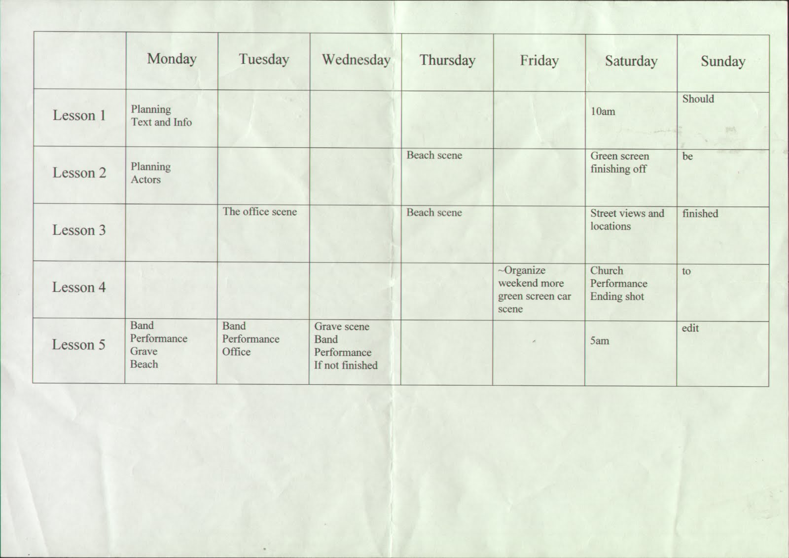
Monday, 25 April 2011

TODOROV’S THEORY – Todorov proposed a basic structure for all narratives. He stated that films and programmes begin with equilibrium, a calm period. Then agents of disruption cause disequilibrium, a period of unsettlement and disquiet. This is then followed by a renewed state of peace and harmony for the protagonists and a new equilibrium brings the chaos to an end. The simplest form of narrative (sometimes referred to as ‘Classic’ or ‘Hollywood’ narrative).
Levi Strauss – Narrative tension is based on opposition or conflict. This can be as simple as two characters fighting but more often at an ideological level e.g. in westerns what do the cowboys and Indians represent? What ideologies are embodied by the opposite sides in lord of the rings or star wars?
In our music video, an accident happens that effects both of our characters (Peter and Ashleigh), along the lines of Todorov’s theory, the video starts, calm, in the middle there is an accident, that causes devastation and completely changes the face of the story. The once calm and happy beginning is transformed into a grim and depressing storyline. The wholes story is transformed based on one little scene or one or two shots, rapidly changing the course of the video.
The opposition to happiness and love is drastically changed, opposition between Peter and Ashleigh being a couple and then being split up because of an accident.
I think our video will suit Todorov’s theory as there is a happy beginning with the couple together, then an fatal accident occurs in the middle that changes the mood of the video, and finally the male character (who started the video so happy, ends it being thoroughly depressed).
By callum Balding.
Thursday, 7 April 2011
Do not Understand the story
Spelling
Colour in
No lyrics on the slide
Lyrics are not in time with the shots
Depressing storyline
Good, clear storyline with emotions
Good use of angles and shots
Seems a gripping story but needs better explanation
Tuesday, 5 April 2011
Sunday, 3 April 2011

Monday, 28 March 2011
Saturday, 19 March 2011
Tuesday, 15 March 2011
The good points:
Emotion
Beach setting was good
Wheelchair prop
The plot
Moving story
Facial Expressions
Laura Disappearing
Acting is very good
Struggling in the sand
Matchs the tone of the song.
The bad points:
Editing
Band performance - original settings
Lip syncing
Instruments - learn lyrics and guitar
Green Screen - let them know its a car crash!!!
Include the flashbacks
Shorten the shots.
More filming
Desk location, make it better
Keep camera still
Laura less cruel.
Tuesday, 1 March 2011


Tuesday, 15 February 2011
Rough Cut Number 2
BELOW IS THE COMMENTS WE RECEIVED FROM THE AUDIENCE AFTER THE ROUGH CUT NUMBER 2
'When watching the video I thought that the main character wasn't wearing the correct clothes for his job role. Secondly, I noticed that the lighting for the band performance was very dull and there wasn't enough room for the whole band to fit on camera'. Luke Thompson
'There was a lot of aspects in the video that I wasn't sure about. Firstly, the bags were in shot during the beach scene, also the lighting was very poor in the bedroom where the band were performing'. Rachael Bell
'Personally, I thought that the wheel chair being on the beach didn't work very well because the character kept getting stuck in the sand. Furthermore, this wasn't realistic as a person in a wheel chair would probably avoid the sand'. Katie Green
'There was one major problem with video that I spotted, and this was the water mark on the camera which showed lack of professionalism. What's more is that the shot were way too long, some more that 10 seconds!'. Dan Shipley
'I thought that this genre of music included more shots of the band performing. When watching this video there wasn't much of a band performance'. Sam Busby
'In some scenes the camera was shaky. Especially during the beach scenes. At the end I was confused at what was happening. The actor disappears with no indication of where he goes'. Scott Shannon
Friday, 4 February 2011
Final DVD Cover Inside

This is the inside of the DVD cover. The audience can view this when they open the DVD box.
Final DVD Cover

This is our Final DVD Front Cover. Our advances on the Rough Cut are the inclusion of the picture format, languages and DVD type. Furthermore, copyright details were included as well as a band website.
Wednesday, 2 February 2011
Final Advert

This is our Final Advert. Moving on from the Rough Cut we decided to include a website so it was easier for the audience to get tickets. We moved the title to a more central position so it would conform to the conventions of a DVD cover.